User Experience (UX) for your Web Site and how important it is
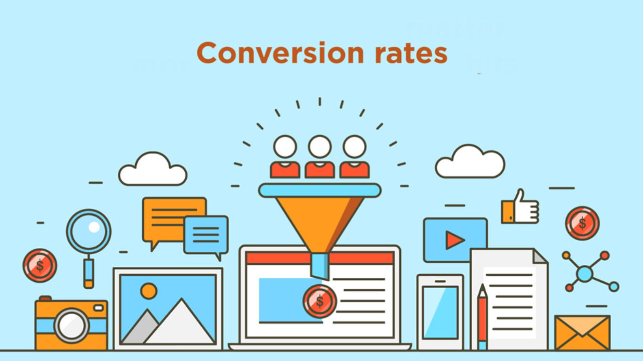
First of all what is UX and UX design? Well quite simply this is not only how your website works, but also (and very importantly) it’s what your users need. So not only is there the obvious technical aspect to this part of your site’s design, but there should also be a deep understanding of the market and your users requirements. UX is closely related to CRO (Conversion Rate Optimisation) in that they both appear at the end of the chain meaning that they can both completely kill any return you might be expecting from building and then ranking your site. You’ve done all the hard work and gotten traffic, but your conversions are poor so something is not right. As discussed recently with CRO it could just be your pricing which is simple enough to fix. This means it has nothing to do with the site and how it works. But let’s say you’re pricing is fine and your conversions from your traffic are low, then surely it has to be something else right? Yes, and it’s almost certainly the way your site works, or what you are or aren’t giving your users along their journey on your site, making them give up and leave.
The main elements that make up user experience (UX)
There are roughly five main areas, some being rather obvious and some not. They are all in sequence too, culminating in the object of your site, which for the purposes of this blog has all been about generating sales or clients for SMB’s (small to medium sized businesses). There is a very good explanation of these elements with a simple diagram here, but broadly speaking they are:
Lets take a little look at each of these as suddenly things might seem complicated and confusing, let alone technical when in reality they aren’t. We all follow these basic premises most of the time when browsing the web but we just don’t consciously analyse it.

Visual Design
This is the most obvious. This is how your fonts look, where the text is on the page, how big text is and what graphical and pictorial elements you have. Some of these maybe be buttons, or links to other pages and they may or may not contain instructions. Not all of this is technical and has an affect on your SEO for example, but it will certainly have the biggest impact on your users. For example horrible clashing colours, too much text with no breaks and titles, hard to read text, pics and text placed in silly places that don’t flow will all lead to us leaving a site.
Navigational Design
The way we navigate through a site is the second most obvious part of the chain, and also the second thing we process in our minds when browsing. Say you have found a landing page and it holds your attention and you want to know more, how do you get there? If you aren’t lead or can’t find the way on your own then you have an immediate problem. The menus, text links, buttons, image boxes, headers, footers, site maps and more all allow us to skip to what we want next. Not necessarily whet you might have had in mind with your page content and it’s journey. Everyone of us is different and our patience is now at an all time low (especially millennials) so you have to cater for everyone. It should be easy to navigate through your site. Obviously the bigger the site the more important this is.
Information Architecture
Information Architecture is probably where it starts getting less obvious, but really again, it’s quite simple. Is there the information we require on that page, and is it being fed to us in a way that maximises it, and in the right order? A recipe site is a good example; lets say you have found the perfect recipe for “Spaghetti Bolognese”. The page quite clearly says its a recipe for bolognese, its looks pretty (visual design), has nice big buttons to take you through the steps or find a similar recipe (navigational design) but suddenly you are a few pages in and they are talking about making it and you haven’t seen the list of ingredients and don’t know where they are? Information Architectural fail.
Content Requirements
Content Requirements is where we need more of an understanding of what our clients and users need. This comes from experince and feedback. Its better to cater for the majority rather than leave things out. It’s a delicate balance as you don’t want to clutter your page but also want to please as many people as possible. Good content design means that everything is there, and those who don’t require that part can easily skip without being affected. Its better to have something and not need it, than to need it and not have it. But knowing these requirements means some feedback (from real users, not just your friends and colleagues) and knowledge of your competitors. Bear in mind, someone ranking well may be an SEO competitor, but if they are making mistakes in this area then you will be simply copying theirs. A site ranking lower can easily generate more business than one who is ranking higher.
Site Objective
The site objective is to generate business, but at the same time it has to fulfil the users requirements too as these two elements go hand in hand. If done correctly you will tick both boxes in one go. At the end of the site journey (whatever route your user takes) there should always be a call to action. I don’t mean just at the end of a page with a contact us button. But it should be constantly there throughout your site in many various small ways. In simple marketing terms it could be expressed as “If value exceeds price, people will buy”. If you are looking for a plumber or a restaurant, we already have a set of preconceived elements we need to be satisfied, so making sure that the value is built along the way can help this. For shopping cart sites it’s fairly simple, but for sites advertising a high street service the site itself doesn’t fulfil their need, the restaurant does so it’s a case of at the end of your site experience not having any more questions and making a decision to go there, book an appointment, visit, sign up etc etc
UX summed up
Its clear that this is quite an in depth topic, and that it has also changed dramatically in a short space of time. Not only have we changed as uesrs, but the technology has changed too. Leaving this aspect of your site unexamined will be costly if your marketing and SEO efforts have been successful as your conversion rate could give you no ROI. For most SMB’s though, even if your site is old, all of these elements are easily rectified and improved and will be worth the time and money if you are generating valuable traffic.


