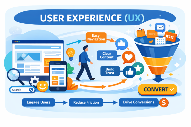
User experience (UX) is one of the most important factors in whether a website actually performs for a business. You can invest in SEO, content, and traffic, but if visitors find a website confusing, slow, or difficult to use, they will leave without taking action.
In simple terms, UX is how a website feels to use. It affects how easily visitors find information, how clearly content is presented, and whether the journey from landing page to enquiry or sale makes sense. This is why UX plays a central role in both conversion rate optimisation and modern SEO.
If a website attracts visitors but fails to convert them, UX is almost always part of the problem.
What Is User Experience (UX)?
User experience refers to how people interact with a website and whether that experience meets their expectations. UX goes beyond visual design and includes structure, usability, clarity, and how well the site supports a visitor’s intent.
Strong UX ensures that:
- Visitors immediately understand what a business offers
- Navigation feels natural and predictable
- Content answers questions in a logical order
- Calls to action are clear and easy to follow
When these elements work together, users feel more confident and are more likely to engage.
How UX Connects to SEO and Conversions
UX sits at the point where traffic turns into results. SEO may bring users to a website, but UX determines whether those users stay, engage, and convert.
Search engines increasingly analyse behavioural signals such as:
- Time spent on a page
- Interaction with content
- Navigation paths
- Completion of key actions
If users consistently land on a page and leave quickly without interacting, search engines interpret this as a quality issue. Over time, this can limit ranking potential even when technical SEO is strong.
This is why improving UX often leads to:
- Higher conversion rates
- More meaningful engagement
- Stronger SEO performance over time
UX and search visibility are closely connected.
The Core Elements of Effective User Experience
User experience is built from several connected components. Weakness in any one area can reduce trust and lower conversions.
1. Visual Design
Visual design creates the first impression. Typography, spacing, colour contrast, imagery, and layout all influence how trustworthy a website feels.
Cluttered pages, inconsistent styling, or difficult-to-read text quickly create friction. Clean, balanced layouts help users feel confident they are in the right place.
2. Navigation and Usability
Navigation determines how easily users move through a website. Menus, buttons, internal links, and page structure should guide visitors without forcing them to think.
If users cannot quickly find key information — such as services, pricing, or contact details — they are likely to leave. Good navigation supports exploration while still guiding users toward meaningful actions.
This is especially important in web design in Pattaya, where many users browse on mobile devices and compare several businesses before making contact.
(One intentional internal link placed here to support the authority page)
3. Information Architecture
Information architecture refers to how content is organised and presented. Visitors expect information to appear in a logical order that matches how they think.
For example, a service page should clearly explain:
- What the service is
- Who it is for
- Why it solves a problem
- What to do next
When content feels disorganised or difficult to scan, users become frustrated and abandon the journey.
4. Content Clarity and Structure
Content plays a critical role in UX. Visitors need answers, not unnecessary complexity.
Good UX-focused content:
- Addresses common questions clearly
- Uses headings and spacing for easy scanning
- Allows users to skip sections they do not need
Well-structured content reduces effort and helps visitors move forward with confidence.
5. Site Objectives and Calls to Action
Every website has a goal, whether that is enquiries, bookings, sign-ups, or sales. UX ensures that users are guided toward that goal naturally.
Effective calls to action are visible, clear, and supported by trust signals. When users feel informed and comfortable, they are more likely to take the next step without hesitation.
UX, CRO, and Other Conversion Factors
User experience is not the only factor influencing conversions. Pricing, offer clarity, and market positioning also play a role.
However, when traffic is relevant and pricing is competitive, poor UX is the most common reason conversions fail. Improving UX is often faster and more cost-effective than trying to increase traffic volume alone.
This is why UX and conversion rate optimisation should always be reviewed together.
Why User Experience Matters
User experience determines whether a website supports or undermines marketing efforts. Weak UX can cancel out the benefits of SEO, advertising, and content investment.
For many businesses, improving UX does not require a full rebuild. Strategic changes to layout, navigation, content flow, and calls to action can significantly improve performance.
If a website attracts visitors but does not generate enquiries, bookings, or sales, reviewing UX should be a priority — particularly in competitive markets.
Frequently Asked Questions
What is user experience (UX) in web design?
User experience (UX) refers to how easily and effectively visitors can use your website. It includes navigation, layout, content clarity, speed, and how well the site supports users in completing actions such as enquiries or purchases.
Why is UX important for website conversions?
UX directly impacts conversions because visitors are more likely to take action when a website is clear, intuitive, and trustworthy. Poor UX creates friction, confusion, and hesitation, which leads to lost enquiries and sales.
Does UX affect SEO rankings?
Yes. UX influences SEO indirectly through engagement signals such as time on site, interaction, and return visits. Search engines favour websites that satisfy user intent and provide a positive experience.
What is the difference between UX and CRO?
UX focuses on usability, clarity, and meeting user needs, while conversion rate optimisation (CRO) focuses on improving the percentage of visitors who take action. Strong UX is the foundation that effective CRO builds upon.
How do I know if UX is hurting my website performance?
Common signs include high exit rates on key pages, low enquiry or booking rates, confused navigation paths, and users frequently contacting you with basic questions that should be answered on the site.
Can improving UX increase conversions without more traffic?
Yes. Improving UX often delivers faster results than increasing traffic because it removes barriers that stop existing visitors from converting. Even small UX improvements can significantly raise conversion rates.
Is UX more important for mobile users?
Mobile UX is especially important because mobile users have less patience and smaller screens. Poor mobile usability often leads to immediate exits and lost business opportunities.
Do small businesses really need professional UX design?
Yes. Small businesses rely on every visitor counting. Professional UX design ensures your website supports trust, clarity, and action — helping your marketing and SEO investment deliver real returns.